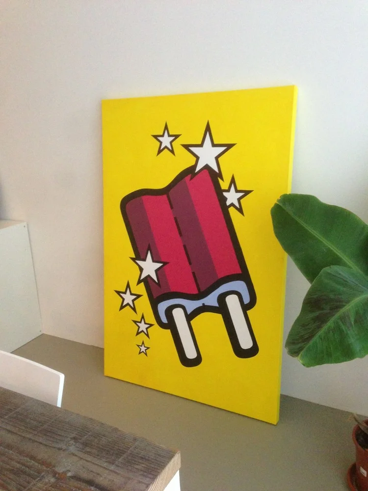
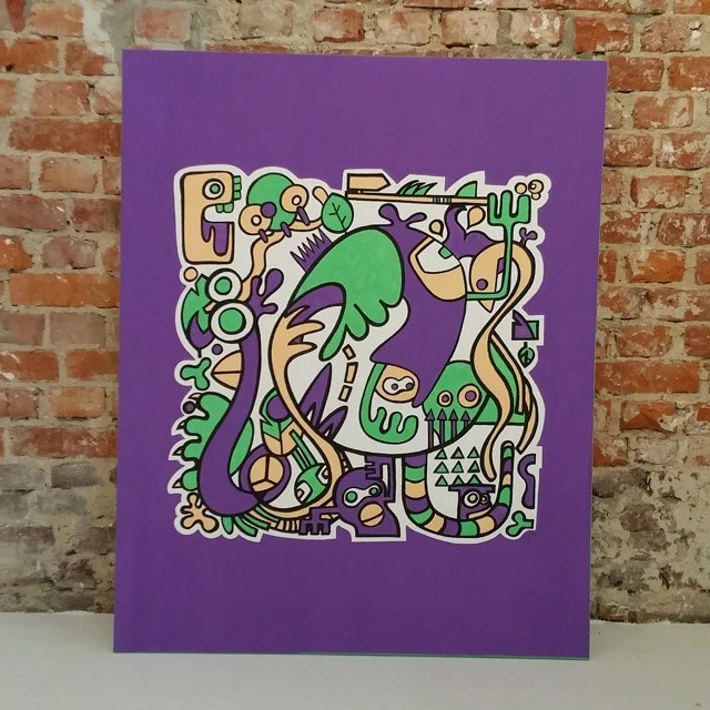
Westerpop Delft 20th Anniversary Jubilee - Final logo
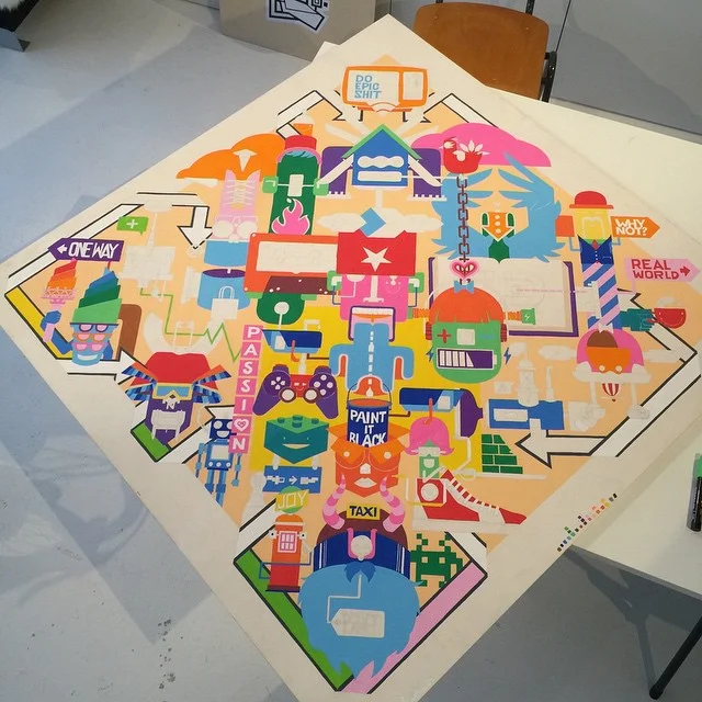
Westerpop is an annual free music festival in Delft, the Netherlands. In 2009 it celebrated its 20th anniversary. I was asked to design the illustrations on the crew t-shirts. By designing the illustration more towards a logo, it's possibilities grew.
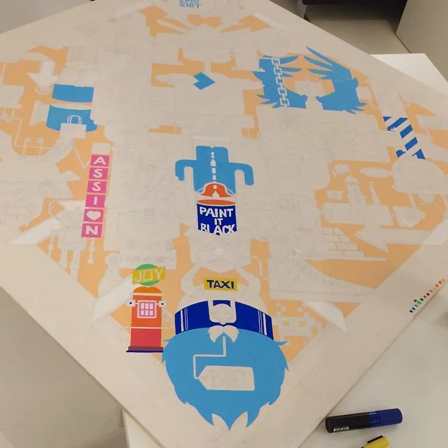
The logo is used in the festival newspaper, promotional posters, t-shirts and flyers. The limited color scheme made it effective in media that didn't support lots of colors.
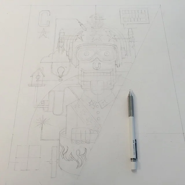
The logo was fully designed in Adobe Illustrator after some preliminary pencil sketches.
How can I help you?
Do you need an identity design or logo design for your own project or brand? Or do you have any questions regarding this particular project, my current availability or about my services as a logo designer? I'd love to help you. Please find my contact details in the footer of this website.
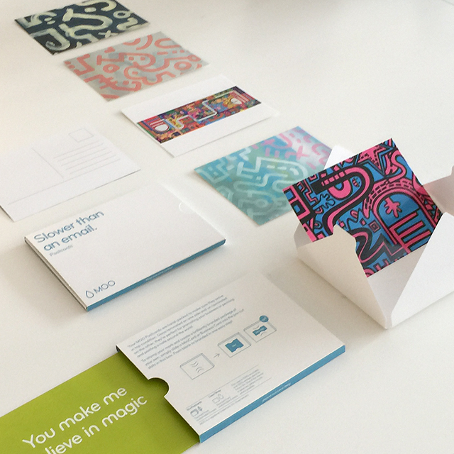
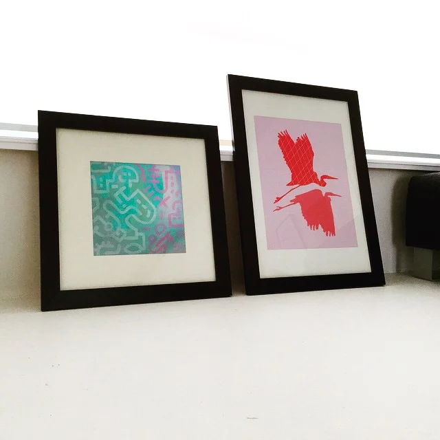
Also check out these illustrations


BLOG // DESIGN & ILLUSTRATION


BLOG // ART


BLOG // INTERIOR & STYLING


BLOG // PERSONAL